Simon Lee | Co-founder at GBC | March 25, 2019
Last month, we shared a sneak peek at some major design improvements we’ve been cooking up for StratPlan 3. Today’s the day — you’ll see those changes in your StratPlan account right now!
There are countless little tweaks and improvements throughout the entire strategic planning software, but here’s quick update of the most important new stuff.
High-level Changes
The examples we showed in the preview still stand: improved navigation, colours, and typography, better use of space on desktop screens, and more consistent placement for buttons, headers, and menus. These changes apply everywhere.

New Navigation Design
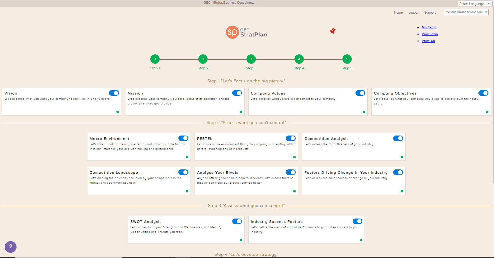
Navigation got a big upgrade. We wanted to give StratPlan’s navigation its own identity and charm, while reducing the complexity of understanding and interpreting the various screen/analytical tools. They’re friendly and easier to read, too.
Navigation got a hard-to-miss status bar, better shapes and font size, buttons to turn on or off screens, and an all-around clean-up.

New My Team
There’s a slick new My Team function that appears on the navigation page. We made is easy to manage activities and teams. So now you can upload as many of your team members and then assign tasks to team members. Monitoring and tracking performance, reassigning tasks, daily workload management have just got a whole lot simpler.

New Task Management
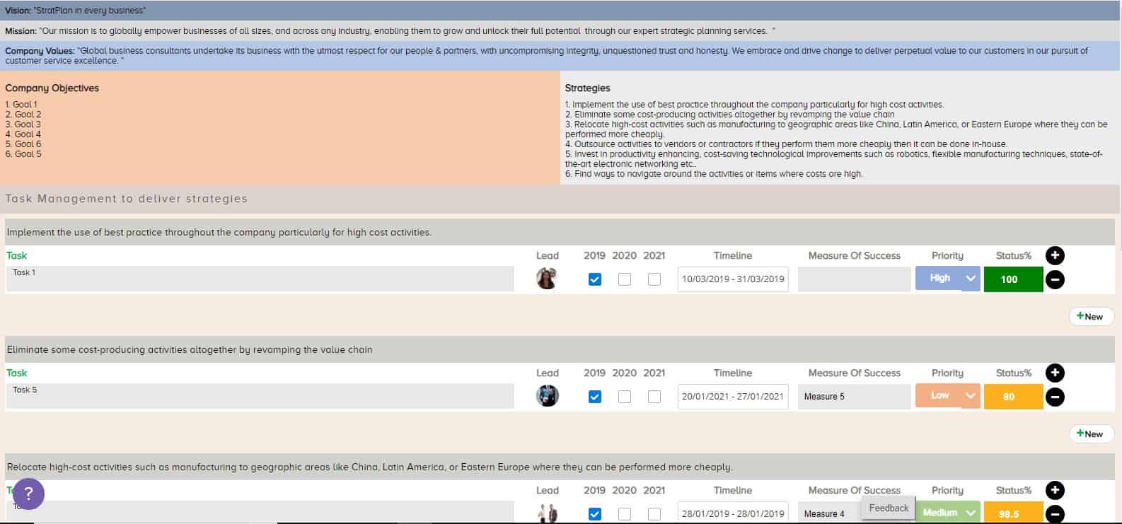
We built on the StratPlan 2’s strategies screen in many ways. First, there’s a new and improved layout that puts every action or daily tasks into your overall company’s strategic context.
Second, now you can get down to minor details and assign team members to tasks, set priorities, assign a timeline to complete each task, insert custom fields, and more.

In the Task Management app Select the task bar in the Task Display panel to move tasks to a new timeline. The dates automatically changes in the Tasks section.

Unified Buttons and Themes
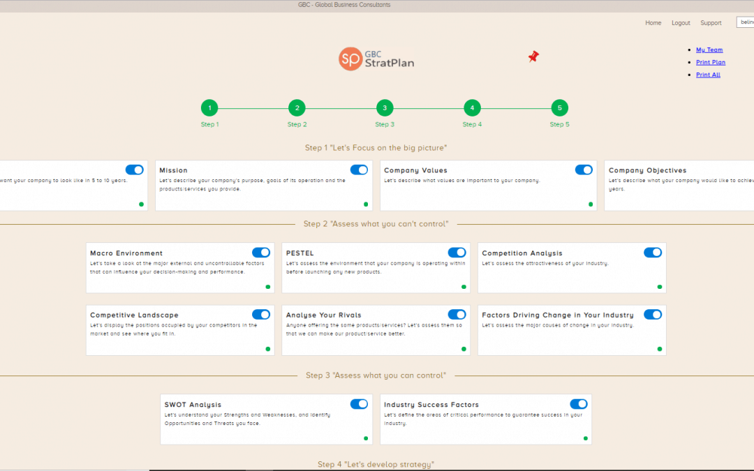
Buttons got a lovely face-lift (they’re all rounded now) and they’ve been themed to match the new StratPlan 3 overall theme. We also sprinkled the theme colour on a variety of other elements.
The green and light creme theme.

Introducing Our New Virtual Planning Helper
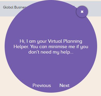
StratPlan as a simple strategic planning software is important – so important that we decided to introduce a new virtual planning helper. Now each screen has an easy to understand helper than you can expand and minimise giving you complete control.

Ahhh, sweet sweet help.
Plus…So…Much…Other…Stuff…
Those are just the biggest changes. There’s a lot more than we can list here such as multilingual (StratPlan is now available in Spanish and German) —so go forth and explore it!
We’re just getting started
We think the upgraded StratPlan 3 is more cohesive, modern, and sophisticated, but still friendly and familiar too. We hope you enjoy the changes as much as we do.
And this is only the beginning. These updates set the stage for a ton of additional improvements we’re planning to make, so keep an eye out for those coming soon. It’s gonna be a great 2019!
Thanks and much ❤️ from all of us at GBC!


